

Understand your analytics
Your Analytics section turns your store’s activity into answers. Find it in the left sidebar under Analytics, and start on the Overview tab — the headline health of your store for whatever date range you choose.
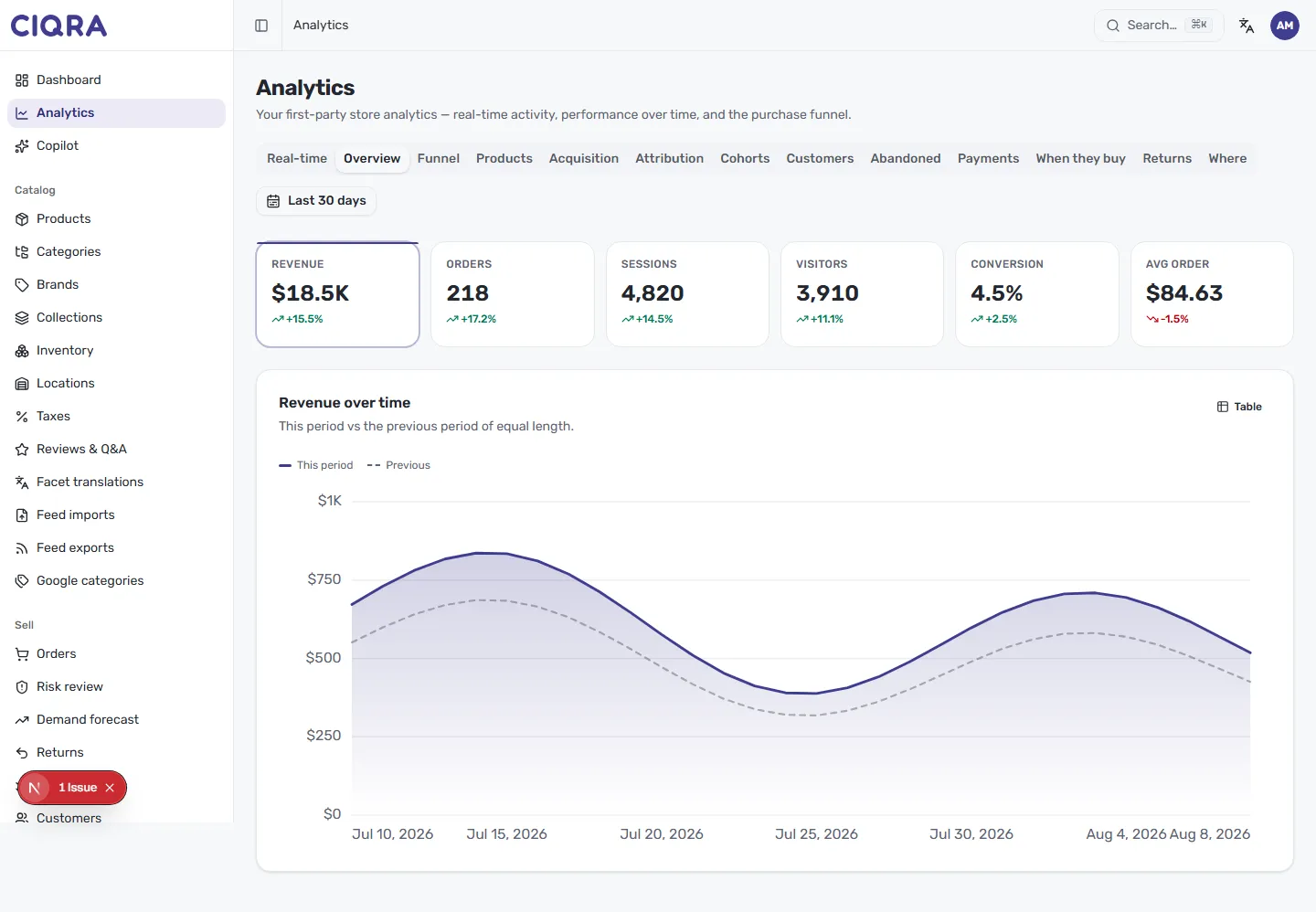
- 1Report tabsOverview is the summary; Real-time, Funnel, Products and more go deeper. Overview is selected here.
- 2Date rangeSets the window for every metric and the chart — for example, Last 30 days.
- 3Headline metric cardsRevenue, Orders, Sessions, Visitors, Conversion and Avg order, each with its change versus the previous period.
- 4Revenue over timeA solid line for this period and a dashed line for the previous one — the gap between them is your trend.
- 5Table viewSwitch the chart from the visual to the exact day-by-day numbers behind it.
First-party, by design
Section titled “First-party, by design”CIQRA’s analytics are first-party — measured by your own store rather than a third-party tracker. That means the data is privacy-aware and consent-aware: it respects shopper choices while still giving you a clear, honest picture of how your store is doing. There are no external pixels to trust and no cookie-banner gymnastics to see your own numbers.
Read the headline metrics
Section titled “Read the headline metrics”Across the top, a row of cards summarises the essentials for your selected range. Each card shows the value plus its change versus the previous period of equal length — green when it’s up, red when it’s down:
- Revenue — total sales in your store’s currency.
- Orders — how many orders came in.
- Sessions — visits to your store.
- Visitors — the number of distinct people behind those sessions.
- Conversion — the share of sessions that ended in a purchase.
- Avg order — the average value of an order.
The revenue-over-time chart
Section titled “The revenue-over-time chart”Below the cards, Revenue over time plots your sales across the range. A solid line shows this period and a dashed line shows the previous period of equal length, so you can see at a glance whether you’re ahead of where you were. The gap between the two lines is your trend.
Select Table in the top right of the chart to switch from the visual to the exact numbers behind it — useful when you want to copy figures or read a precise day-by-day breakdown.
Change the date range
Section titled “Change the date range”The date control at the top right (for example, Last 30 days) sets the window for every metric and the chart. Every card’s versus previous period comparison automatically uses the matching window before it — pick 30 days and you’re comparing against the 30 days prior.
Where to go next
Section titled “Where to go next”The Overview is the summary; the other tabs go deeper. To see live activity, open Realtime. For the full set of reports and what each one answers, see Every report, at a glance.