

See how customers come back
Getting a visitor once is good; getting them back is what builds a business. The Cohort retention report shows exactly that — how each week’s new visitors return in the weeks that follow. Open Analytics in the left sidebar and select the Cohorts tab.
The summary cards
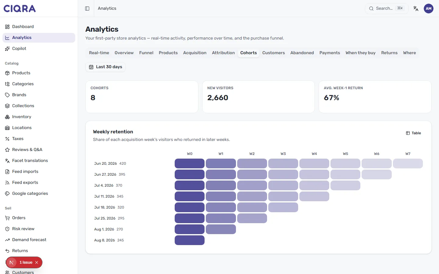
Section titled “The summary cards”Three cards summarise retention for your range:
- Cohorts — how many weekly groups are shown.
- New visitors — the total of first-time visitors across those cohorts.
- Avg. week-1 return — on average, the share of a cohort that came back the following week. This is your single headline retention number.
Read the weekly heatmap
Section titled “Read the weekly heatmap”Weekly retention is a grid. Each row is a cohort — everyone who first visited in a given week, labelled by date (for example, May 23, 2026) with the cohort’s size beside it. Each column — W0, W1, W2 and so on — is the number of weeks since that first visit. W0 is the acquisition week itself, always the fullest.
Read a single row left to right to follow one group over time: the cells step from dark to light as fewer of that cohort return each week. A darker cell means a higher share came back; a lighter one means fewer did.
The grid forms a triangle — newer cohorts (lower rows) have had fewer weeks to age, so they have fewer cells. The most recent week shows only W0.
Read it as a table
Section titled “Read it as a table”Select Table in the top right to switch from the heatmap to the underlying percentages and counts for each cohort and week.
Pair it with customer value
Section titled “Pair it with customer value”Retention tells you who comes back; the customer report tells you what they’re worth. Continue to Customer value and segments.